

Collaborations we love
The role of PR has changed significantly over the years. While traditional media used to take centre stage, social media and influencer marketing have now become an essential part of modern communication strategies. Today, creators play a major role in how brands become visible, tell stories and connect with their audience, each in their own way and with their own distinctive style. That’s why we wanted to highlight a few collaborations we truly loved working on.
Below, discover five very different collaborations we realised for Little Greene, ranging from neutral beige paint shades to bold, colourful wallpaper.
Nina Nijland
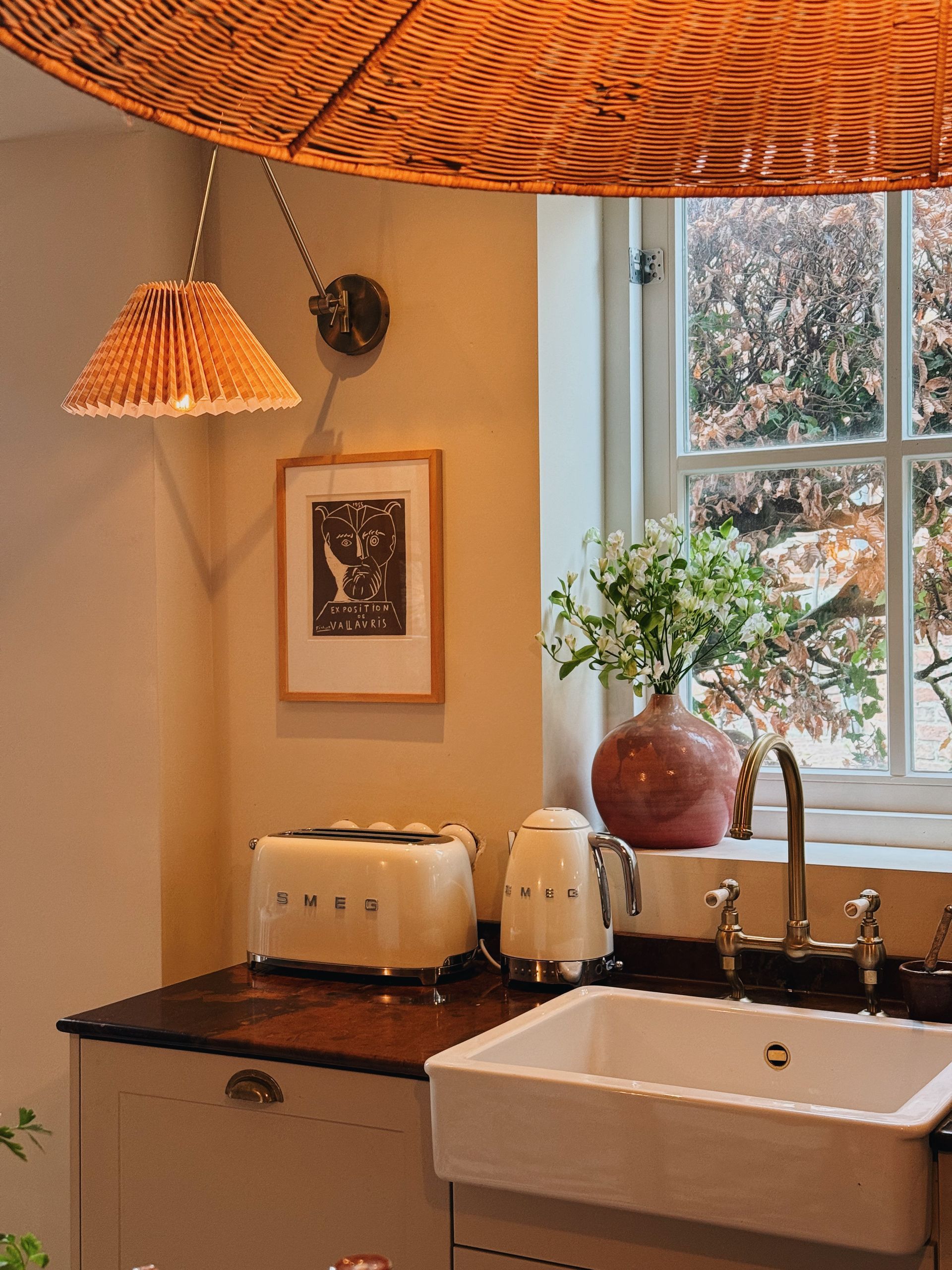
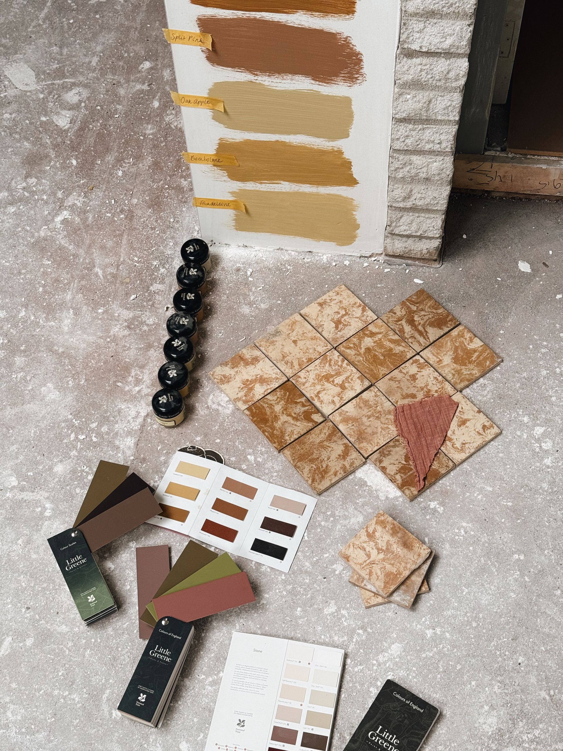
With her warm visual style and strong sense of colour, Nina Nijland creates interiors with a truly distinctive atmosphere. Together with her partner, she left Amsterdam for the Dutch countryside, where they are currently renovating their ‘Project Dream House’. Sustainability plays an important role throughout the renovation process, including the choice of paint and materials, making Little Greene a perfect fit for the way they live and renovate.
Colour and material play a leading role throughout the house, with shades such as Blush, Nina’s personal favourite, alongside warm nuances like Clay, Ashes of Roses, Mushroom and Bath Stone. Soft powdery tones, rich earthy colours and characterful wallpaper come together to create an interior that feels creative, personal and full of warmth.
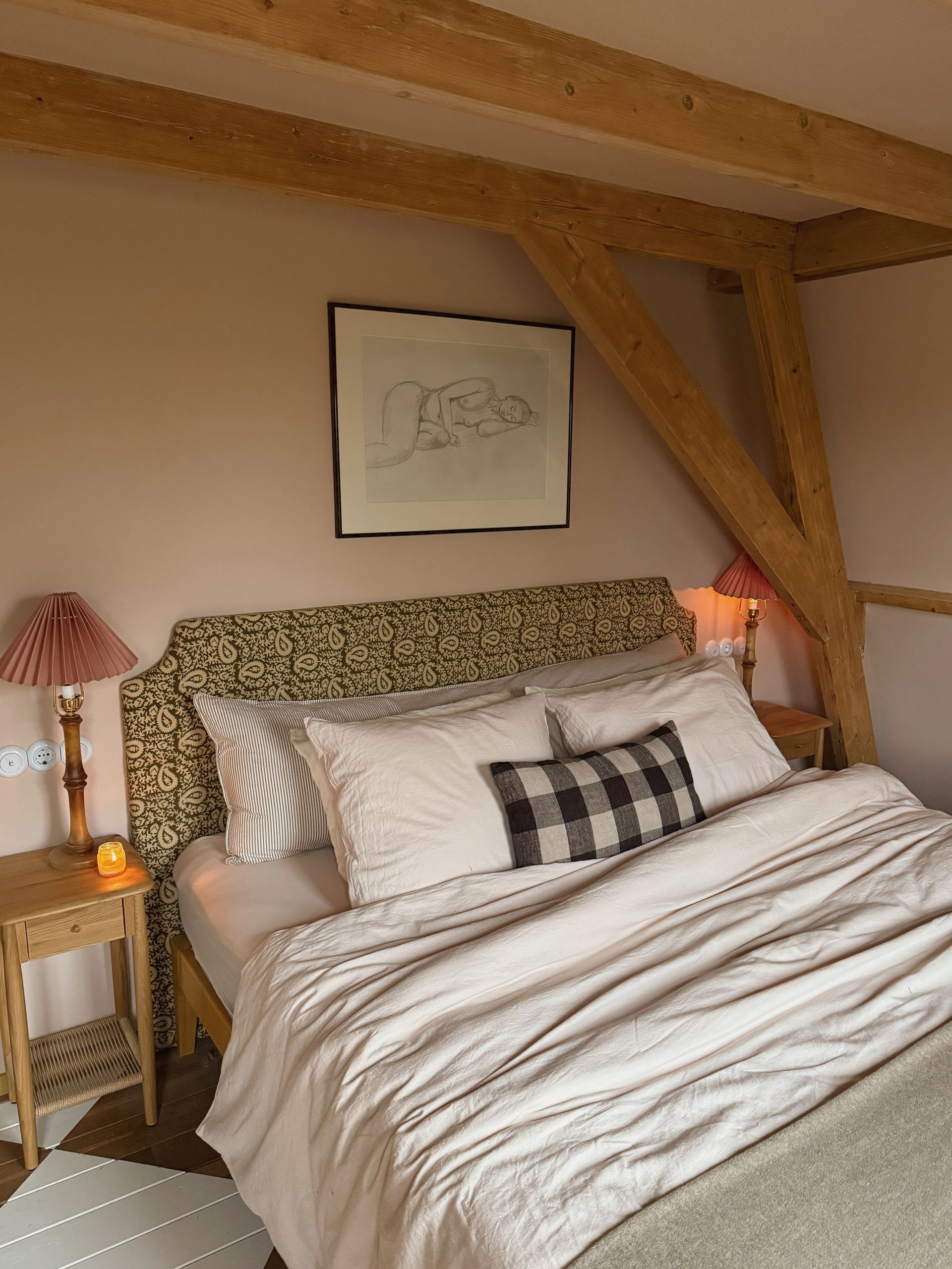
Wies Beijen
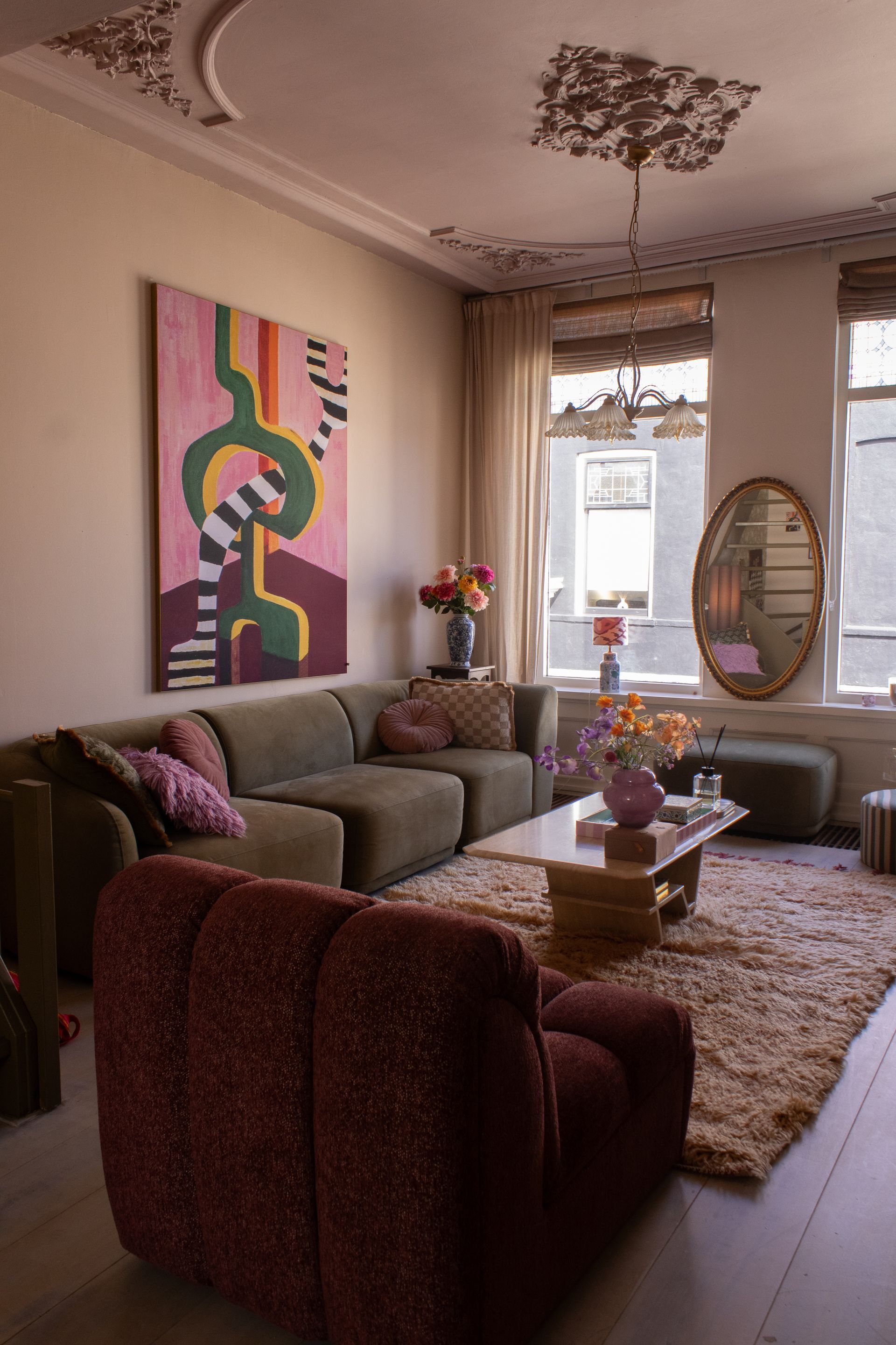
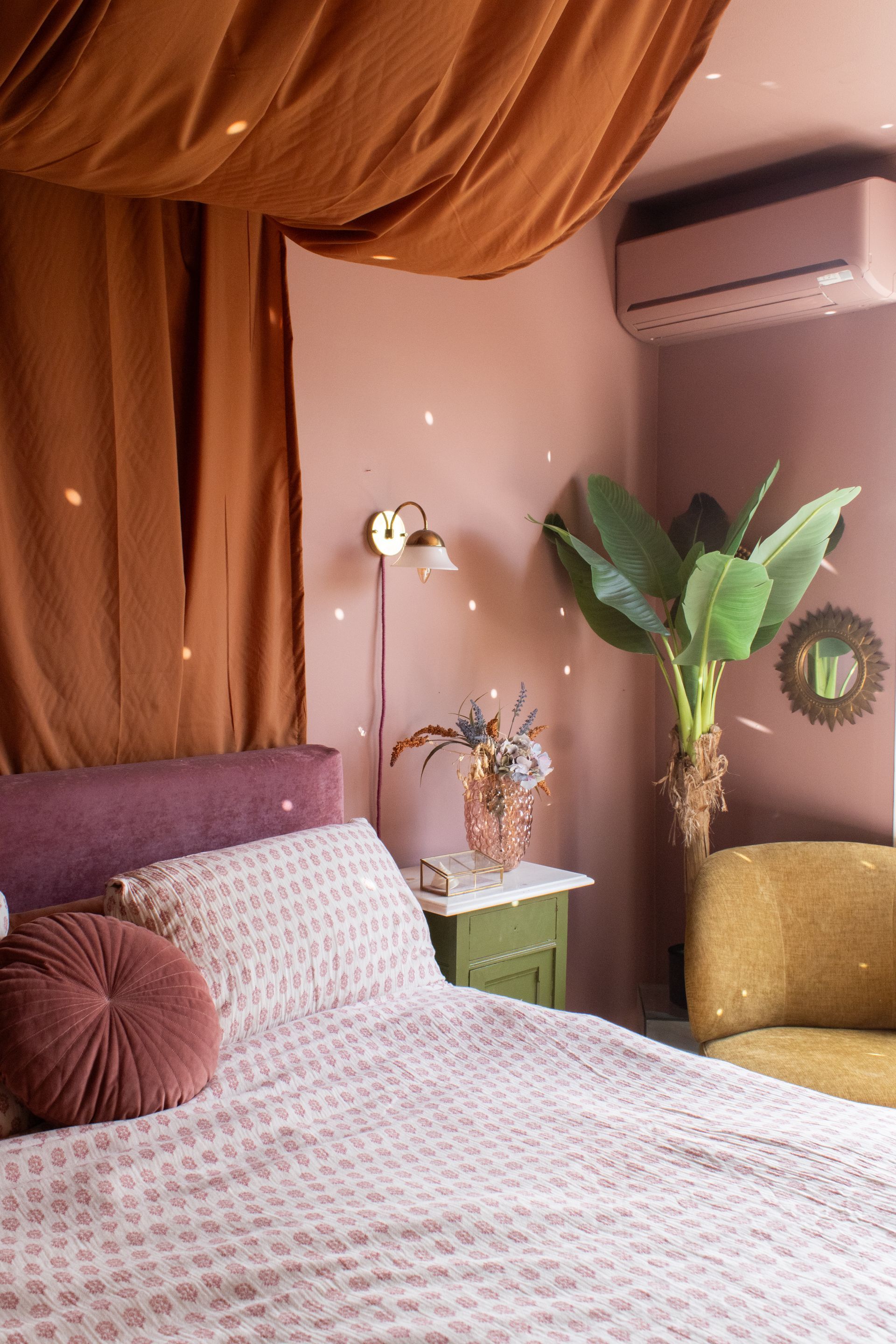
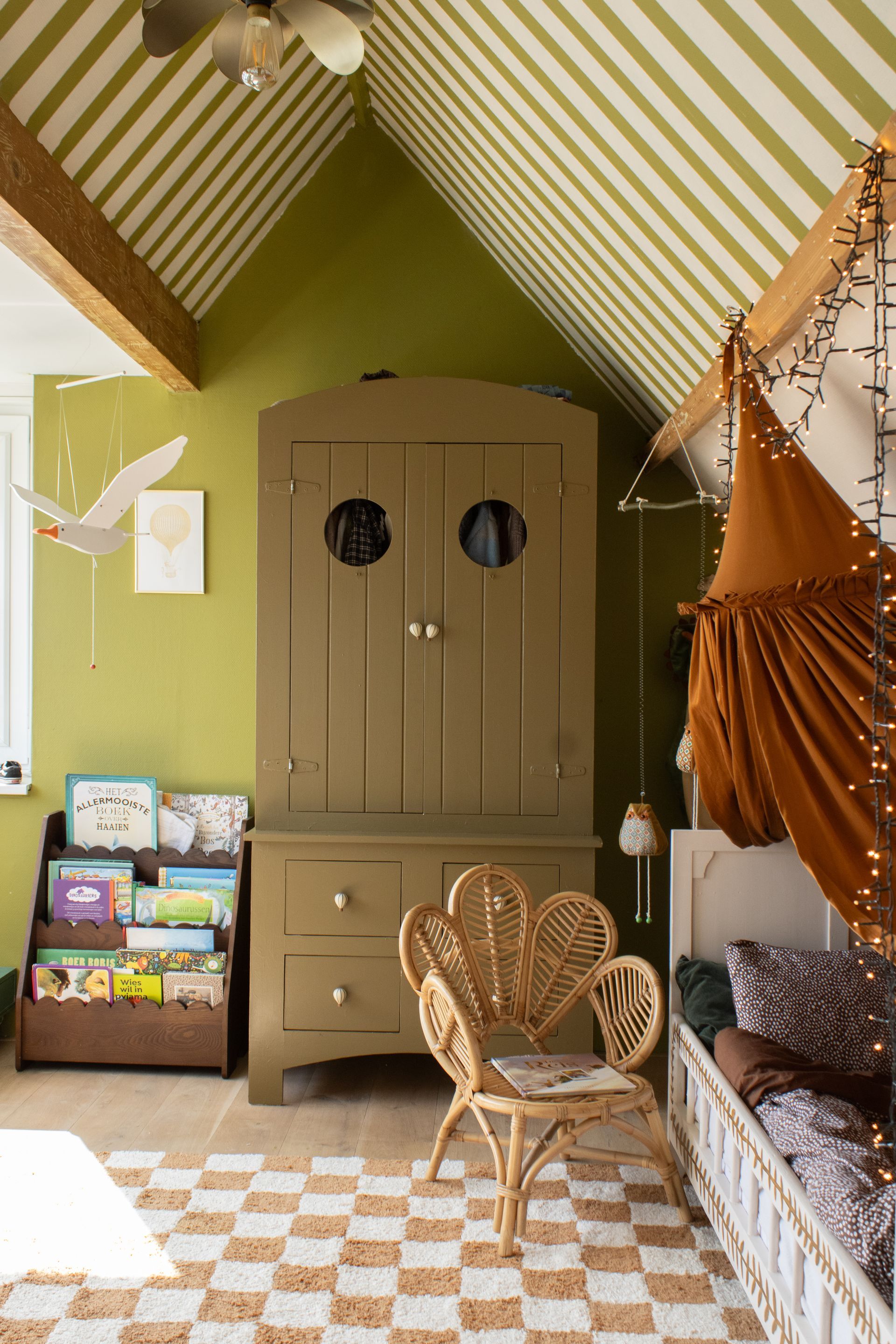
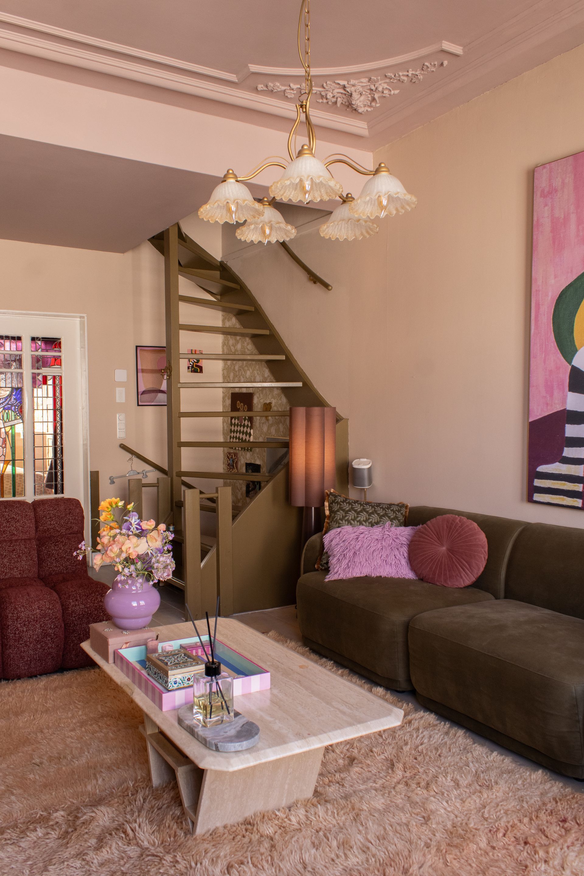
Under the name @dailydoseofgoldie, Wies has been sharing interior inspiration from her characterful old warehouse home for years. Her style feels warm, bold and full of contrast, with daring colour choices and unexpected combinations that always feel personal and unique. No paint project is too ambitious for her, from colour drenching and painted floors to even painting the air conditioning unit in the bedroom. Always with colour taking centre stage.
In the living room, she combined Beauvais Lilac with a Light Peachblossom ceiling and a staircase painted in Light Bronze Green. Her son’s bedroom received a playful update with vertical stripes in Citrine, Olive Colour and Julie’s Dream, while her own bedroom, including the air conditioning unit, was fully drenched in Blush.
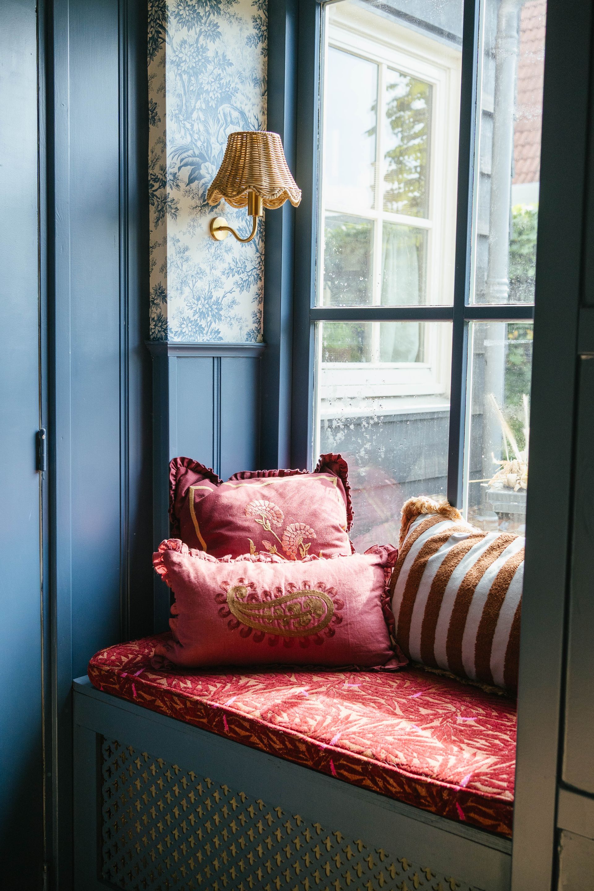
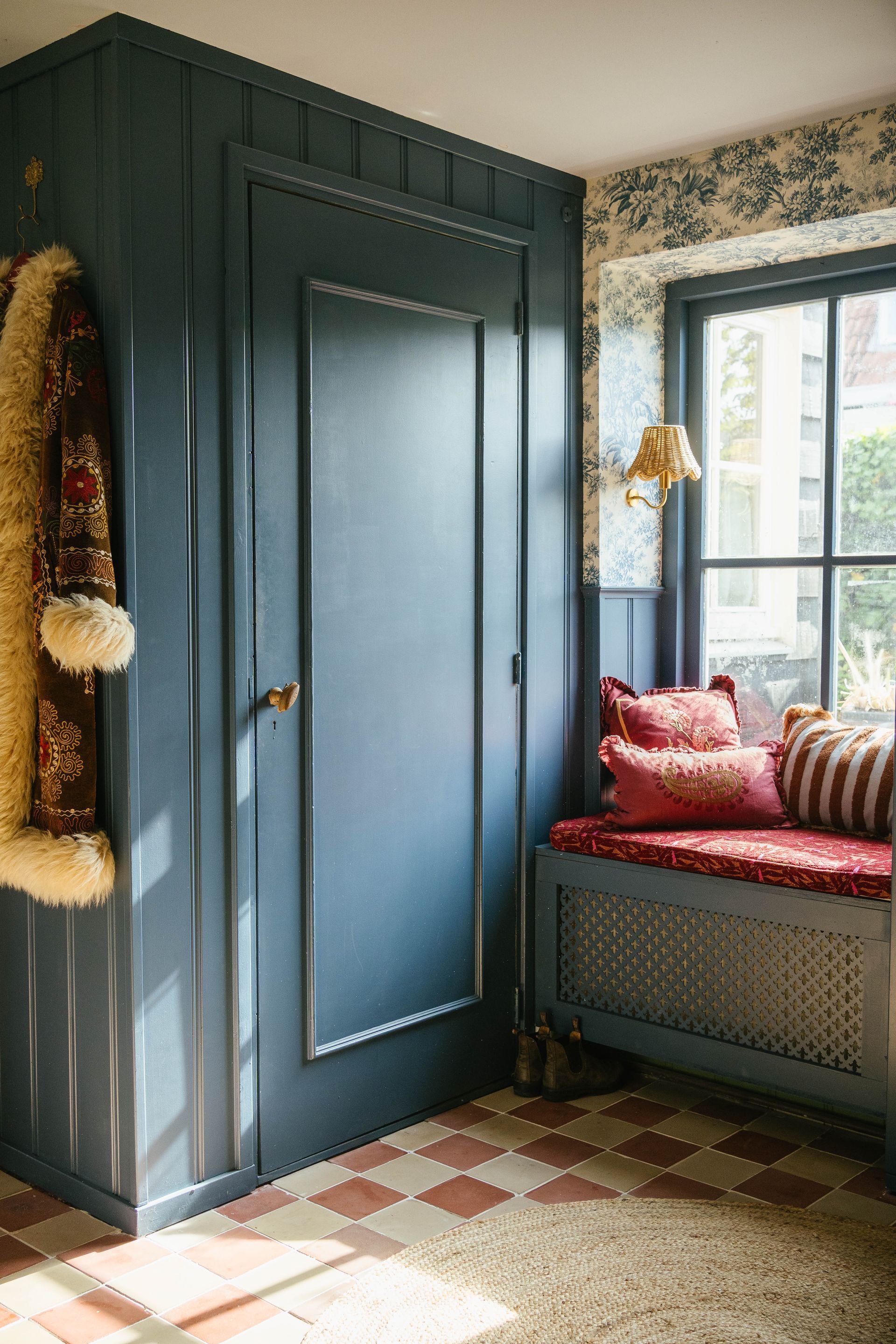
Juul Elisabeth
In Juul Elisabeth’s home, blue takes centre stage, through layers, nuances and details that effortlessly flow into one another. Her style feels warm, romantic and full of character, combining different shades of blue with richly patterned wallpaper to create a truly distinctive atmosphere.
She chose a layered colour palette featuring Brighton on the panelling, Hick’s Blue on the wardrobe and Delicate Blue on the ceiling. The Stag Toile – Juniper wallpaper ties everything together beautifully, adding depth, character and a real wow factor to the space.


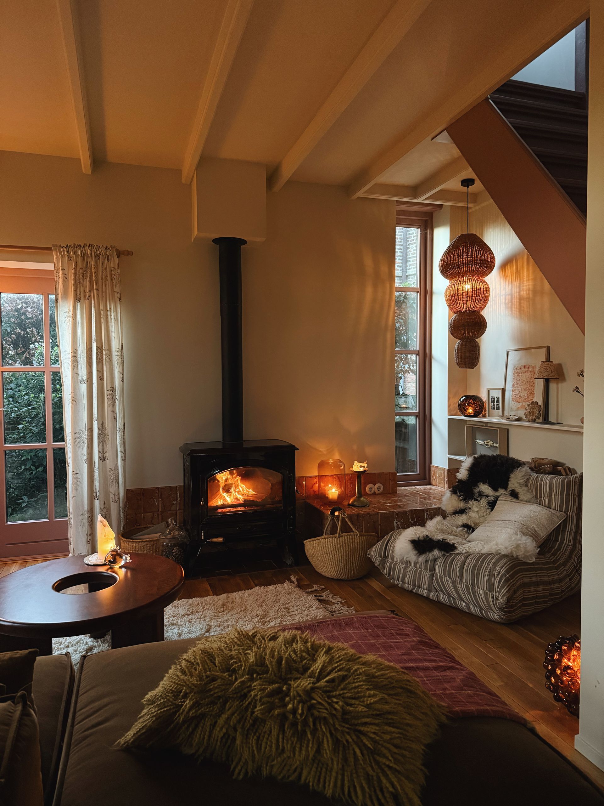
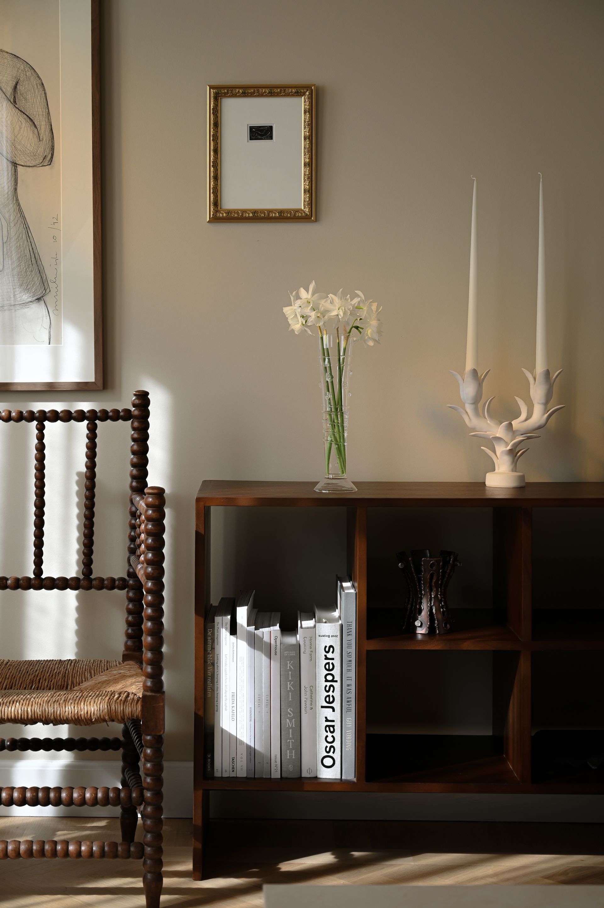
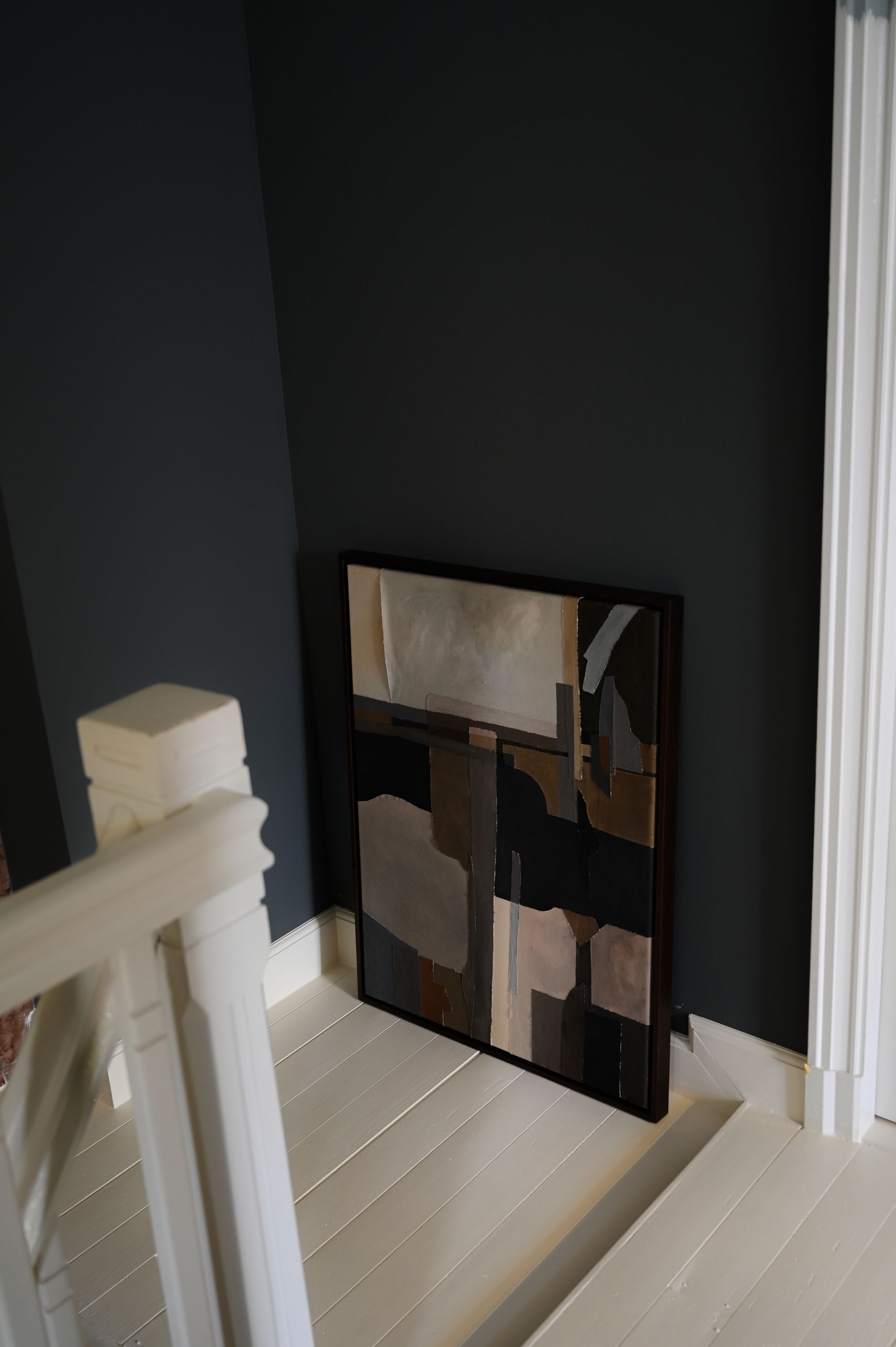
Michiel Bosman
Photographer Michiel Bosman knows exactly how to capture atmosphere through imagery. Together with his partner, he lives in a beautiful old home where original details and a calm, understated style come together. His photography feels warm, soft and layered, much like his interior.
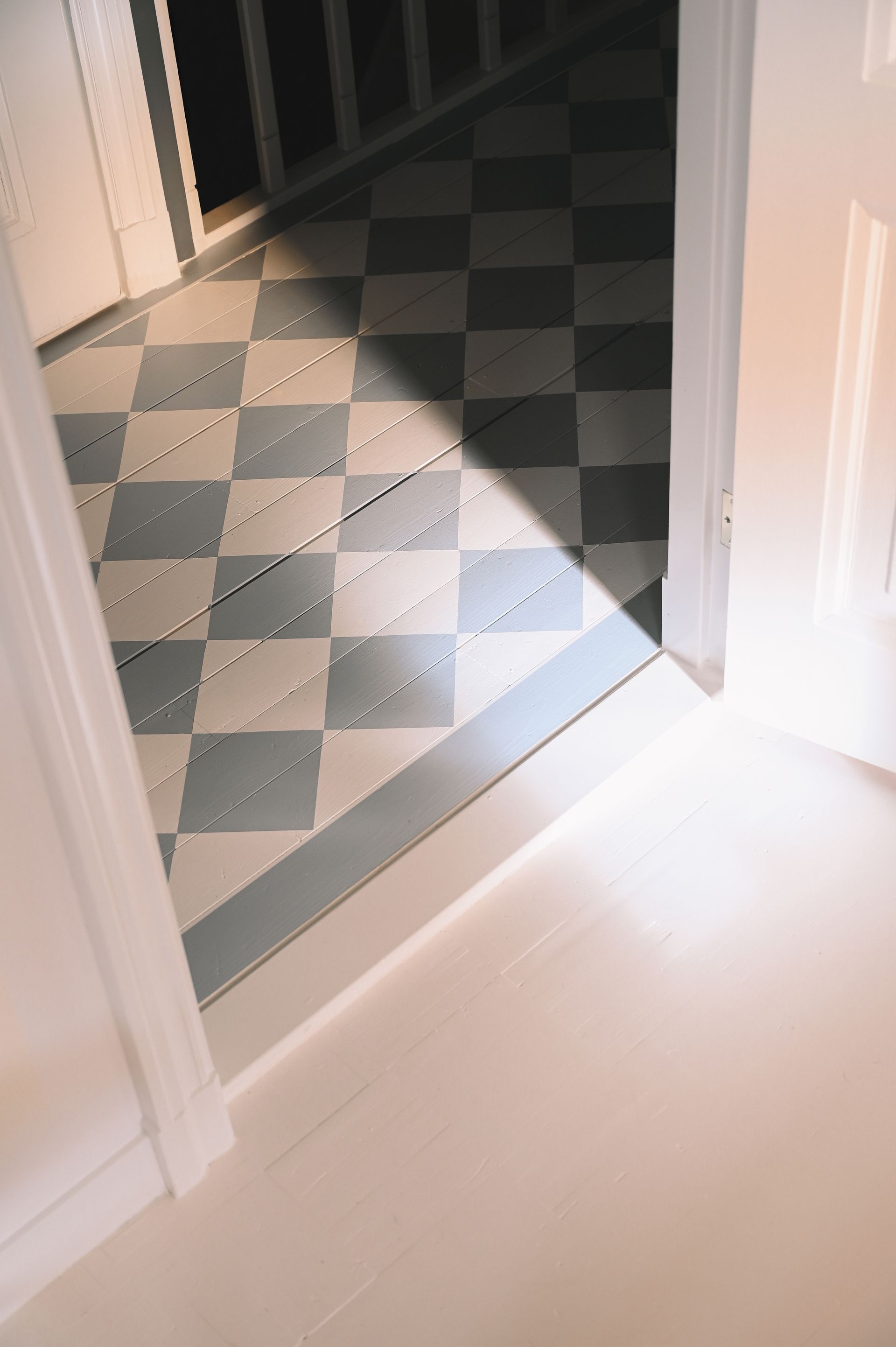
Throughout the house, a wide range of colours take the spotlight: from soft shades such as Silent White and Joanna to richer tones like Oak Apple, Light Gold and Light Bronze Green. More daring choices also find their place, including the checked blue-and-white floor painted in Obscura, showing just how transformative colour can be within a space.
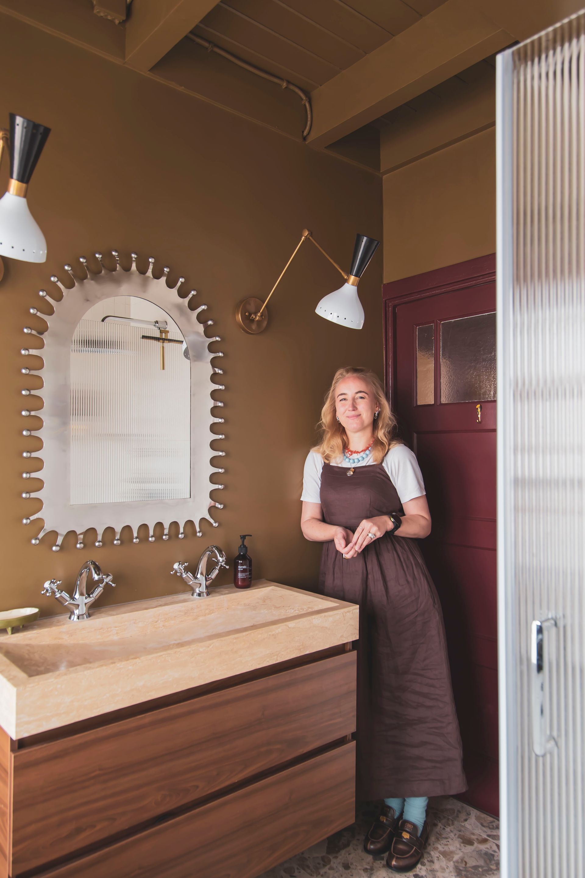
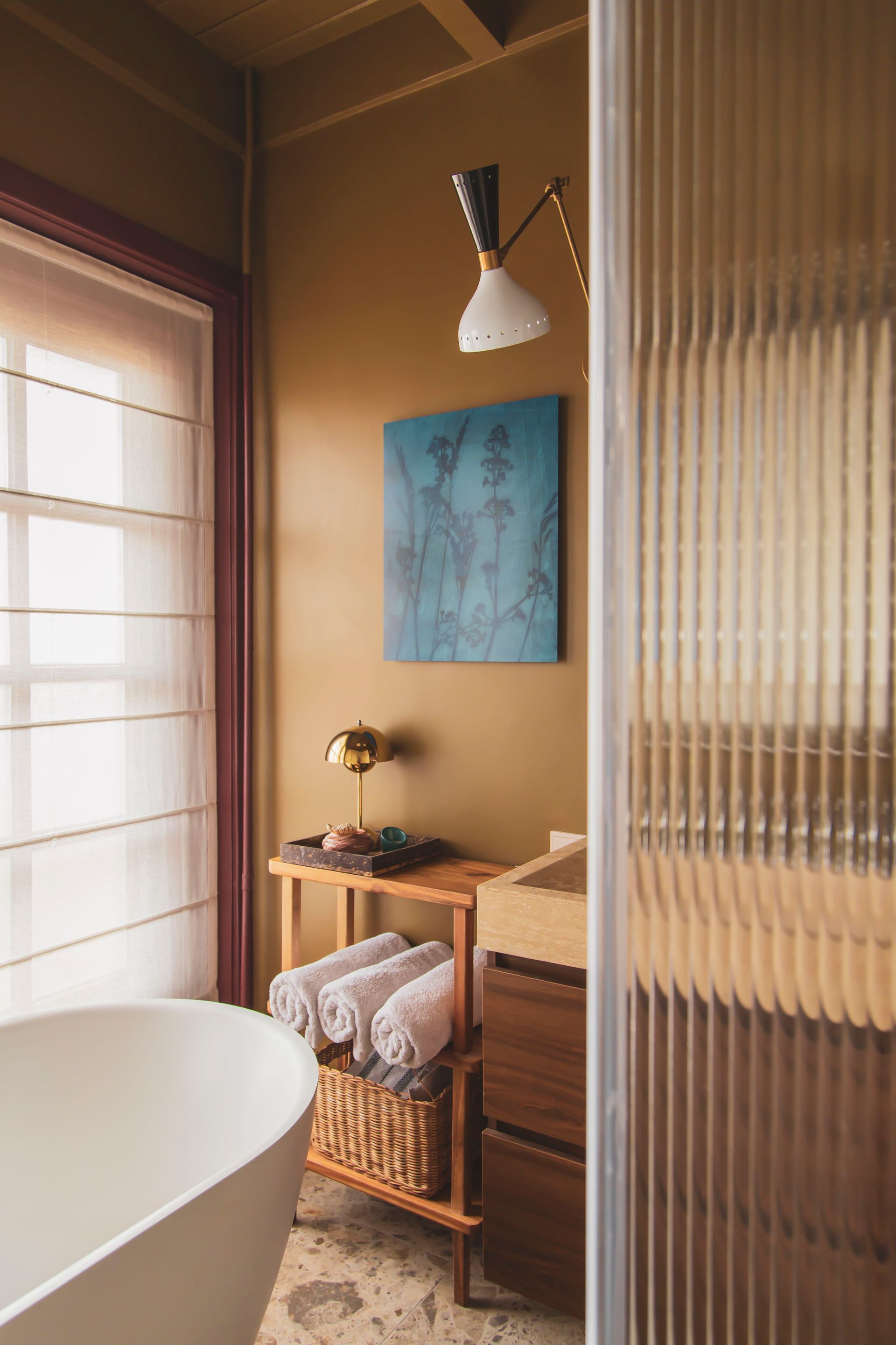
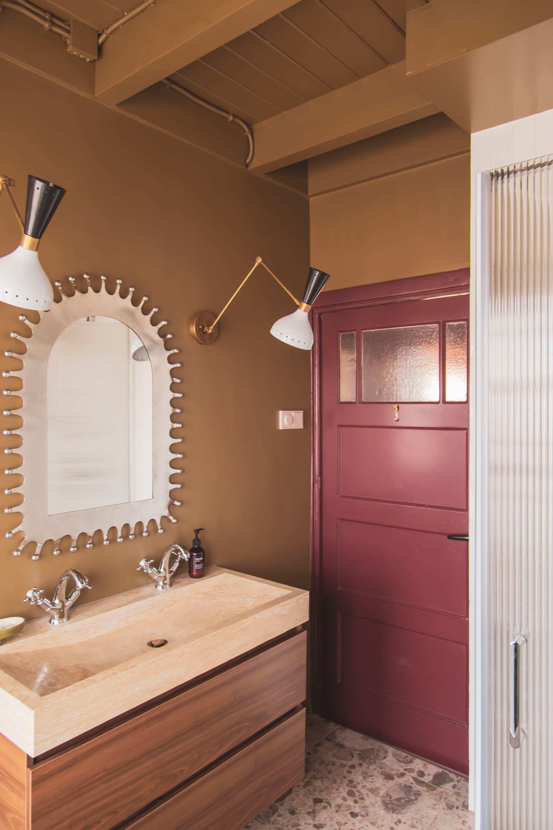
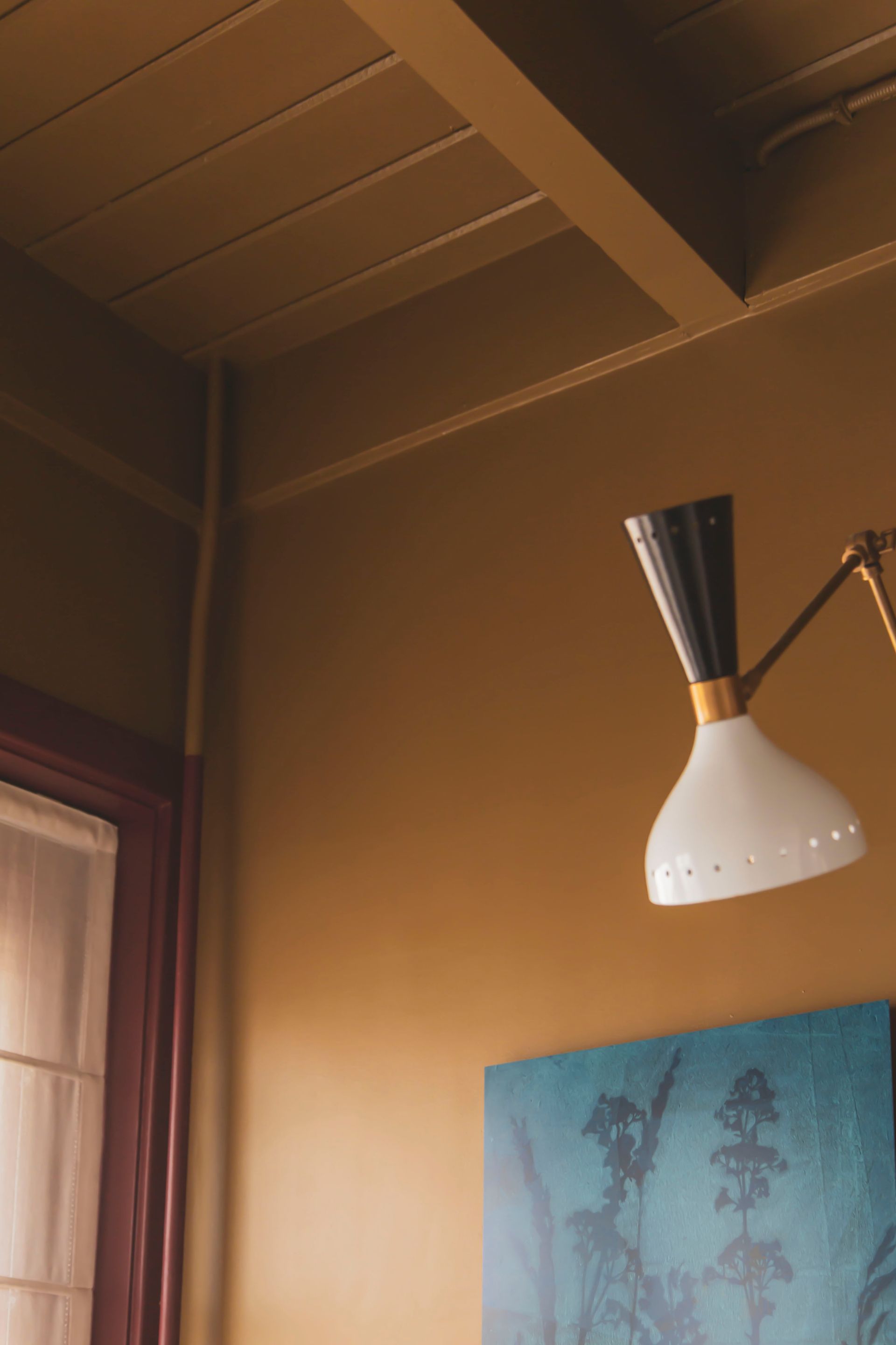
Marrit de Lang
Under the name @donebymyselfblog, Marrit de Lang has been sharing colourful interior inspiration with her followers for years. Her home is defined by bold colour choices, expressive combinations and a playful mix of art, wallpaper and distinctive details, maximalist, yet always balanced.
For the makeover of her bathroom, Marrit chose Light Bronze Green, a soft green shade that works beautifully alongside the warm red and purple tones already present in the space. The result feels bold, creative and perfectly balanced, with colour acting as the true mood setter.